

Conditional Formatting Examples: Algorithms
There are 5 main algorithm models for setting conditional formatting to grids. With various logic variations, this yields 11 different techniques for defining conditional formatting.
| Type | Example |
|---|---|
|
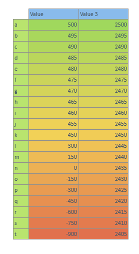
Percentile Color Scale: Column 1 shows a 3 color graduated scale from the lowest to the "inflexion" point to the highest value. By default the inflexion point is set to 50% or the median point. Users however, can adjust the inflexion percentile up or down from 0% to 100%). This will change the spread of the color shading between the 3 poles as shown in column 2. |
|
|
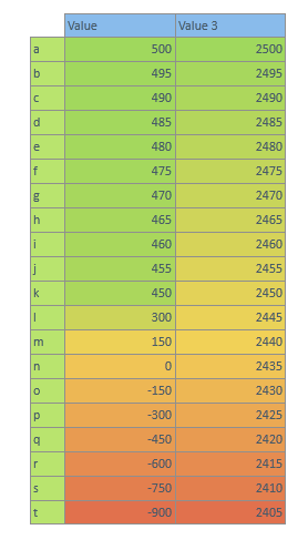
Average Color Scale: Column 1 shows a 3 color graduated scale from the lowest to the average to the highest value. The average is fixed. The Median gradient is shown in contrast in column 2. |
|
|
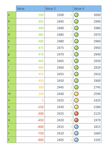
Ranking: Column 1 shows percentile ranking of cells based on the rank of the ORDER of the cells. The top tertile is in green, the second tertile is in yellow and the bottom tertile is in red. Column 2 shows percentile ranking of cells based on the rank of the VALUE of the cells. Value ranking assigns a rank based on the distribution of values, not the distribution of the cells' ordinal position. As such, all values above 2000 fall into the upper tertile and are ranked 1. Value 1550 to 1850 fall into the middle tertile and are ranked 2. The remaining values fall into the bottom tertile and are ranked 3. Column 3 shows a quartile ordinal ranking using light icons, similar to column 1. |
|
|
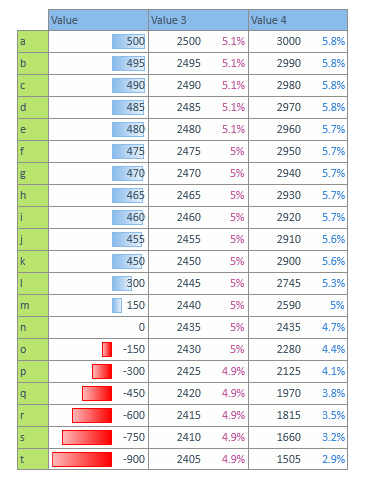
Percents: Columns 1 and 3 show percent of range. The range is determined as the cell's value divided by the ABSOLUTE MAXIMUM value across the selected cells. For column 1, the maximum is negative, so the cells are divided into positive and negative values and the data bars are assigned proportionately to the full range. In column 3, the maximum is row "u" - which is 100%. All the other cells are shown as a percentage of the maximum. Column 2 is the more standard percentage of total. The numbers reflect each cell's proportion to the total of all values in the column. NOTE: The figures will be misleading when distinct measures are used. |
|
|
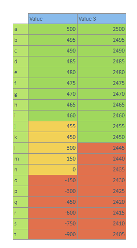
Discrete Bands - Fixed Bands: Column 1 is a tri-band model with red all value from the minimum to 0; yellow from 0 to 460; green from 460 to the maximum. Column 2 is a dual-band model with red from the minimum to 2400; green from 2400 to the maximum. |
|
|
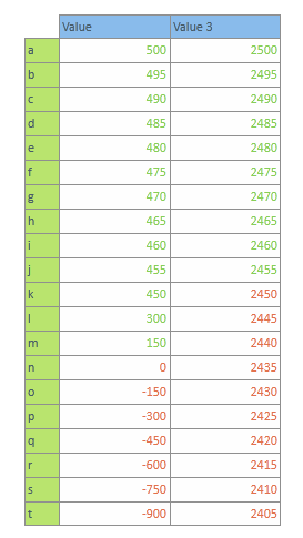
Discrete Bands - Average and Median: Column 1 shows all values below the average in red and all values above the average in green. Column 2 shows all values below the median in red and all values above the median in green. |
|
|
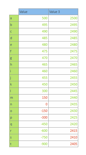
Discrete Bands - Standard Deviation and Percentiles: Column 1 shows all values that are within 0.5 standard deviations from the mean in red. All values more than 0.5 standard deviations are shown in green. The target of 0.5 standard deviations is set by the user in the dialog. Column 2 shows all values that are in the bottom 20th percentile or less in red. All other values are set in green. The target of 20th percentile is set by the user in the dialog. |
|
Home |
Table of Contents |
Index |
User Community
Pyramid Analytics © 2011-2022